When Bryan and Paul first reached out to me to design the Northeast Magic Judges playmat, I was pretty excited. As a long-time Magic player, having the chance to work on an official playmat was a pretty cool opportunity. I’ve been playing the majority of my life at a casual and later semi-competitive level, and have a great deal of respect for the members of the judge program who put so much time and energy into making Magic events of every level a possibility for players. I was particularly excited to be doing an illustration specifically for the judges of the Northeast region, where I grew up and first started playing as a kid.
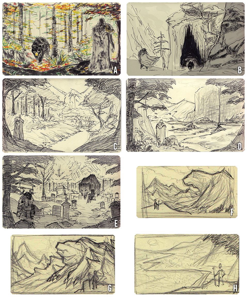
I sat down with Bryan and Paul to talk about project, and they explained that the illustration should first and foremost show off the Northeast’s landscape and climate. They also asked me to include some sort of adventurer-like character to give the scene a sense of place and scale. Finally, Bryan kept calling Paul “Bearz”, which gave me the idea to include a bear as a source of conflict and action in the piece (and also because bears are just awesome). With this information, I set off to put together a series of rough “thumbs”, or smaller concept sketches, to present to the team.
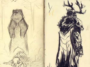
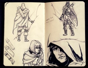
We got together to discuss the thumbs and began narrowing down the compositions we wanted to move forward on. Bryan and Paul expressed a particular interest in the more autumnal scenes, which we thought could make for a particularly strong painting. The more physical representations of our bear-elements in thumbs A, B, and E made for much stronger story-telling, but the bear’s posture was a bit too adversarial for the team’s liking. We also felt at this time that the character was a bit too knightly, and discussed creating a more ranger-like or survivalist design moving forward.
We talked more specifically about what sort of story we wanted to tell with the illustration, what the Judge Program really means to those involved, and what we wanted the various elements to represent. The Judge Program, Bryan explained, is really a journey in and of itself. The themes we wanted to represent were those of mentorship, personal exploration and growth, and the journey one takes to become a certified judge. We talked about re-envisioning our bear character as more of a spirit-guide for our adventurer, reflecting on the idea of mentorship and leadership. We further felt that Thumb D did a great job at illustrating the idea of a journey, with a starting point for the character, a clear destination in the distance, and a literal path between the two.
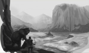 With a clear direction in mind I began painting. The process begins with a rough value sketch. Value refers to the range of lights and darks in a painting, and is used to establish compositional elements and proper lighting before moving into color detail.
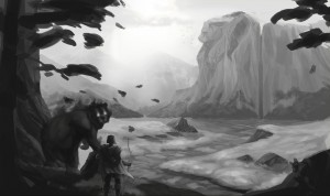 Continuing the value painting, we made our spirit bear a bit more spirit-y, and played around with adding some more bear elements to our environment. I roughly blocked in the missing foreground elements, refined the atmosphere, and we were ready to begin painting over with color.
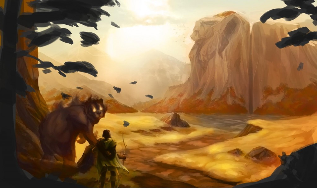 Adding color to a value painting in a digital format is a fairly painless process. Many digital artists working in photoshop employ the method of using a color blending layer to assign color information to a painting while preserving the value detail beneath. The effect is similar to performing a color “wash” in traditional painting media, and is used by the majority of Magic artists whose illustrations appear on MtG cards.
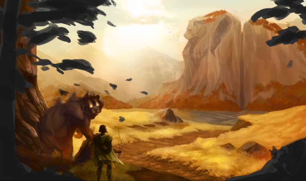 Next I went through and refined the level of detail or rendering throughout the painting. This involves a lot of texture work; making sure the grass reads as grass, the dirt as dirt, and so on. This particular part of the painting process can be the largest time sink. Some more work is done on our bear to give it more of an ethereal quality.
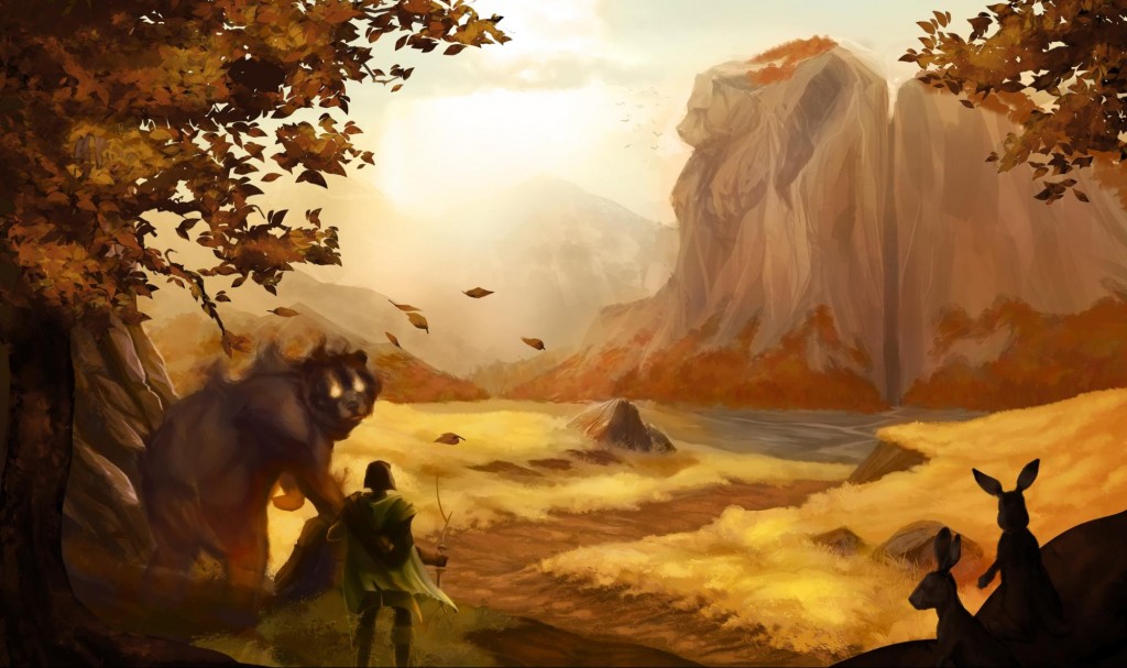 Continuing the painting, I went in and fleshed out the super-foreground elements. Bryan and Paul had mentioned wanting to bring a little more life to the environment, and this was a great opportunity to do so. I added in a couple inquisitive wild hares as a fun nod to Bryan Hare, and painted in the fall foliage.
At this point we took some time to address a few of the issues we were experiencing with the painting. Our bear was looking a little too spooky where we were hoping for a more venerable being. We also felt that the concept of “the journey” was getting lost and could use some reinforcement.
Waystones proved to be the perfect solution to reinforce scale and theme in the painting while also adding some more interesting elements into the middle ground. I used this as an opportunity to tie in some more bear-elements to our environment, and had the idea to make our spirit friend’s glowing eyes blue (a more soothing and noble tone) which we could echo throughout the painting with blue strips of cloth adorning our waystones. The blue brought a nice complementary element to the predominantly orange and yellow composition, tying things together very nicely. A few final color edits and subtle post-processing effects and we arrived at the final image.
We were all really excited to see the final piece come together. I personally had a lot of fun working on this illustration, and it was a real treat to be able to make this painting for the Northeast Judge community. I hope you’ve enjoyed this glimpse into the world of digital illustration, and hope you have a blast bringing this playmat into battle with you on your next adventure!

