
Ivan Petkovic L3, Germany
I hate writing articles, I really do. I believe text is the worst medium for communicating ideas. It’s boring compared to conversation or video. Also, it’s one-directional without interaction or feedback. The danger being: what makes sense in my head doesn’t necessarily make sense in yours.
So what does my rant have to do with presentation design? Well, don’t make presentations like articles: one-directional, text-heavy and disengaging, aka boring.
How?
Well, I’m glad you asked.
Part 1. Fighting Tradition
How many times have you thought: ‘OMG NOT another presentation OR lecture OR meeting…’? I have, a lot. And with good reason.
Ladies and gentlemen, let me present you enemy number one of engagement and cure for insomnia:
So, this template expects me to start “adding text” and then the result is something like this:
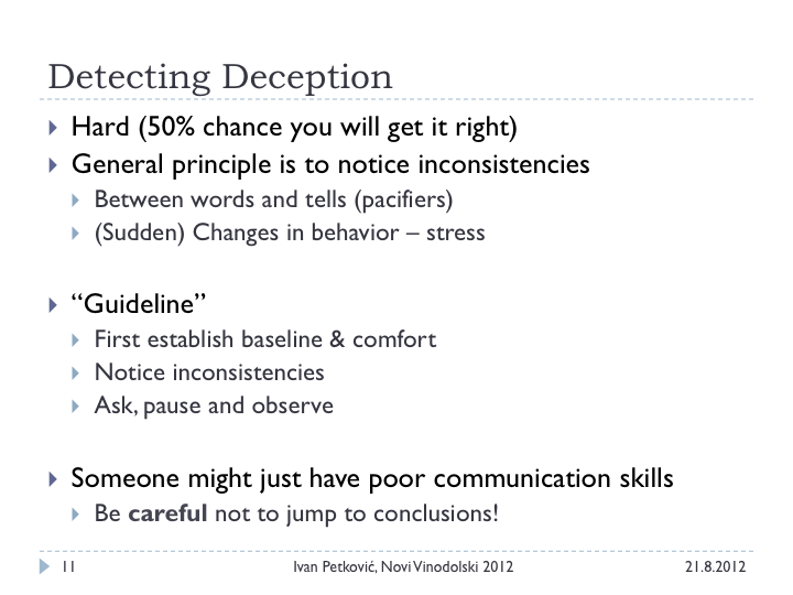
(p.s. this is a slide from one of my early judge conference presentations. I helped many people cure insomnia.)
Let’s see how this slide could look like by applying the principles you will learn here:

OMG!!! Where did all the text go? How can anyone understand this slide? Well, ladies and gentlemen, let me break the truth to you:
The audience is there to listen to you, not read your slides.
You are the source of text, not the wall behind you.
Shocking! Outrageous!
I know. So, moving on…
Part 2. Recipes
I will now demonstrate some basic recipes or principles you can start applying today. And I promise you; they will change your (presentation) life.
- Signal to Noise Ratio
Instead of focusing on theory, let me jump straight to an example.
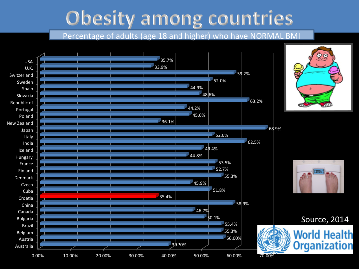
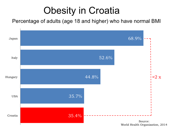
Imagine I want to discuss the problem of obesity in Croatia (my homeland). I could (and many do), make a slide like this:

All data is there, all information. But does it help to convey my message? There is so much going on. Millions of numbers, title, subtitle, logo, pictures, all sorts of colors… My brain is fried trying to process all this info. And even though your audience might be smarter than I am, their brains will be boiling after a couple of these. Let me help them a bit:
Ok, fewer colors for a start, but still tiny, itsy bitsy numbers. Can it be done better? Yes it can!
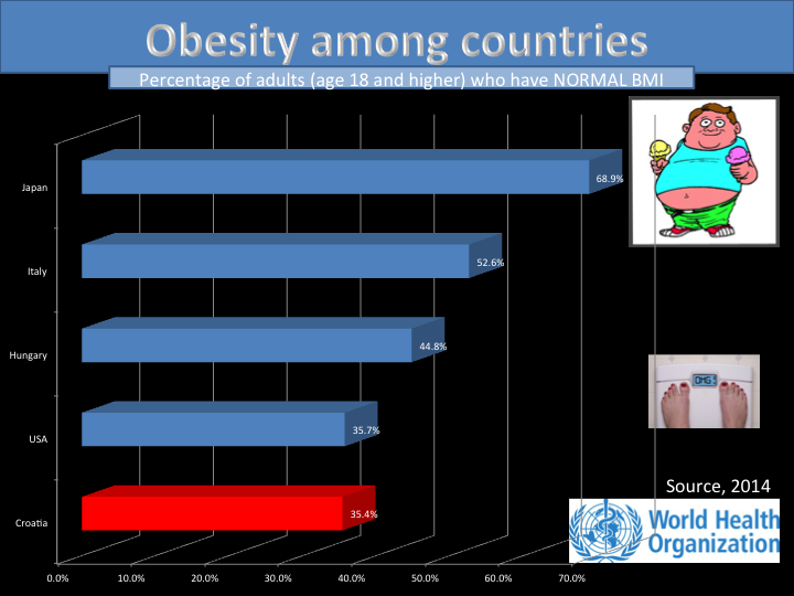
Ok, now it is clearer, but do I really need that guy and feet and logo (and 3D effect)?
Easier? So what was done?
The message was made clear: Croatia has roughly double the number of obese people than Japan.
Eliminate all that in nonessential. It is not about the data, it is about the message that you want your audience to get.
- Going Visual
This one is a no brainer, but so many people forget: a picture says a thousand words. As an example, compare those two:
Again, slides are supporting what YOU are presenting, not the other way around.
Images create associations and emotions that emphasize your speech. Text on slides does the opposite.
Less text, more visuals.
One “problem” with visuals is that you need to be more prepared since there is no text to read. But isn’t that the reason you are reading this article anyway?
A quick tip on preparation: test and practice! I know, it is such a crazy idea!
Here is how I do it: I invite my friend(s) for coffee or dinner and ask them: “Would you mind giving me some feedback on a presentation I am working on?” No one has ever said “no”. Try it. It is another conversation topic.
Please use high quality visuals. Nobody likes blurry pictures. They make your work look unprofessional (and lazy). And of course you should try to make sure you have the legal right to use the pictures – lots of image search websites will allow you to see images which are available under licences like the Creative Commons.
- Empty Space
I have seen so many presenters desperately trying to put as much as possible on their slides. Because, the more the better. Or if we don’t have so many slides, the presentation won’t take as long. Right?
Following that logic we come to the obesity example slide from before.
White space lets your lines, text and images breathe.
It emphasizes what is important.
It turns the attention from the slide to you.
Notice the difference:
That’s quite some information to process and incorporate for the time being. The first three principles talked about eliminating the nonessential. The remaining four rules talk about optimizing what is left. Join us on our second part for next series to find what these are about!
Is this an interesting read? Do you also have something to say about slides and seminars? We are always looking for feedback, but even more for collaborators! It doesn’t matter if you want to help writing already scheduled articles, or share entirely new ideas. Contact George or Ivan
, and let the Judge Community know what you think.