
Ivan Petkovic L3, Germany
Welcome back! I guess you liked what you have seen!
Thank you. And you also remember everything?!? In case you don’t (and there was a LOT of stuff), here is a short recap:
– Text slide is pure evil! And has tendency to multiply and grow. So, handle with care
– There are 7 rules, 3 have been covered:
- Signal to Noise Ratio
- Going Visual
- Empty Space
Bottomline: Remove nonessential (and more things are than you think) and keep things simple and clean.
So, now moving on with…
- Rule of Thirds
The first three principles talked about eliminating the nonessential. The remaining four rules talk about optimizing what is left.
How do you make static visuals less static? (Since we are by now mostly using visuals to engage audiences, right?)
What photographers have found out is that symmetric pictures are static. If you move the (main) object, by one or two-thirds in any direction towards the edge of the photo, you suddenly get dynamics. Why?
Because we are expecting something to come out of all that “extra” space. And that is exciting to us.
Compare these two pictures:

Which one is more interesting?
Also, having elements of the visual in “thirds” can happen multiple times on a single picture. Can you notice multiple “thirds”?:

Let me help.

Here you can see: The text is 1/3 of the horizontal photo while the photo is in 2/3. The hand is in 2/3 while the rest of the person is in 1/3 of the vertical photo.
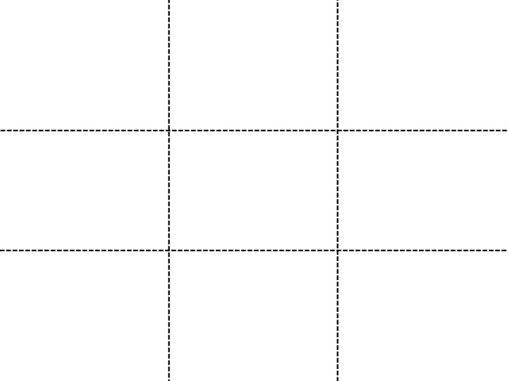
How to achieve rule of thirds on your slide? First turn on (static) guidelines in the presentation software you are using (google for details). Most guidelines are by default made for static compositions (1/2-1/2 and not 1/3- 2/3). You will need to adjust your guidelines to 1/3 and 2/3 of your screen vertically and horizontally. After that comes the positioning of visual and textual elements in horizontal and vertical thirds.
You should get something like this:
Remember, this doesn’t mean you can forget about the first three principles.
Use rule of thirds to create dynamic and engaging slides.
- contrasT
Human beings are primed to notice contrast. And we are surrounded by it everywhere and everyday – every story has a hero and a villain, every day there is light and darkness, every moment of our lives has ups and downs. (Or if you want to be less dramatic, just look at how people dress.)
Since we are so good at noticing it, let me just give you examples of contrast you should use:


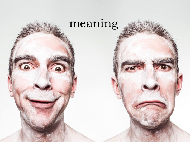


Use contrast to emphasize and create emotions.
- Consistency
This one is simple to follow if kept in mind. Pay attention that your slides together make a whole regarding to fonts, templates and visuals you use.
For example, I usually use one to two fonts in my presentations. Also, I use the same style of visuals (e.g. I don’t mix photos with drawn visuals). If I use a template (which I rarely do), I use the same one during the entire presentation. Another example would be having a “summary” slide after each chapter.
One subtle consistency I love to use, is applying the rule of thirds through the entire presentation.
Consistency ties your entire presentation together making it whole.
- Placement
While consistency talks about arranging elements through multiple slides, placement talks about arranging them on a single slide.
How you arrange elements sends a message: are they united or fragmented, are they equal or not, is there order or chaos?
The size of the elements also sends a message: some are more important than others (for example think of title – subtitle – text hierarchy in articles). Here are some examples:

This doesn’t relate only to abstract objects like circles. Let’s analyze this photo:
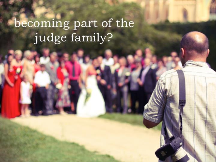
There are two groups: a photographer and wedding participants. Also, the emphasis is on the photographer because he is in the foreground (and bigger) compared to others. These are some of the messages that this photo is sending. How you use them on your slide (and your overall story) is up to you.
There is no rule on how to do placement right, it depends on the message you want to send with your slide.
Element placement on a single slide sends a message.
Be aware of it.
Part 3. Putting the pieces together
Now that you know all the principles, here are some tips & tricks on how to use each principle in real life.
Eliminate the nonessential. It is not about the information or data. It is about the message you want to send. This should be applied when initially building slides as well as when revising them after the whole presentation has been finished.
A picture says 1000 words, so use them extensively. You are the source of information, not the slides. Slides exist to emphasize you, not to be self-sufficient. Powerful and high quality visuals create strong emotions that engage your audience. When searching for visuals, think about metaphors that support your speech. By communication orally and visually through metaphors, it will be easier for your audience to get the message.
Don’t be afraid to use empty space to your advantage. It helps you to emphasize the essential elements. I prefer using one image as a metaphor with a couple of words that will support the image. This way the audience can quickly process the slide and pay attention to me.
By following rule of thirds, visuals and the slide itself become more interesting and dynamic thus engaging. And it is easy to achieve: I use huge, high quality images (larger than 2MP on Google image search). Then I use only part of that image (crop the rest) respecting the rule of thirds. This way I can turn a static image into a dynamic one.
Contrast is another tool you can use to create and emphasize the emotional component of your speech. There are many types of contrast: colors, lighting, meaning, between slides… Whenever possible I use contrast and most of my slides have contrast built in. But be careful that contrast is actually emphasizing what you want and not something else.
Make your slides consistent by using the same font(s), styles, templates and visual types. Rules are meant to be broken but only when they are broken deliberately (like when you want to show contrast by using two different fonts in parallel). You can often see this principle broken in corporations where people “borrow” slides all the time from each other.
The relationship between elements on a slide sends a message: those that are bigger, closer and more on the left and on top are perceived as more important than others. Be aware that you don’t send the wrong message and confuse your audience.
One more thing
I still hate writing articles. This one has been filled with a lot of principles, rules and details. I don’t expect that tomorrow you will remember the seven recipes we have been talking about. (and for your convenience they are: 1. Eliminate the nonessential, 2. Go visual, 3. Empty space, 4. Rule of thirds, 5. Contrast, 6. Consistency and 7. Placement)
Since this is an article, this means you can go and read parts of it again next time when you are preparing your presentation.
But if I have to leave you with one last and most important message, it would be this:
Cluttered, text-heavy presentation design confuses audiences, while a visual one supports you and helps you focus.
Is this an interesting read? Do you also have something to say about slides and seminars? We are always looking for feedback, but even more for collaborators! It doesn’t matter if you want to help writing already scheduled articles, or share entirely new ideas. Contact George or Ivan
, and let the Judge Community know what you think.