Mobile is the future. That is was what we heard more than five years ago, but the blogs network is finally catching up…
What changed?
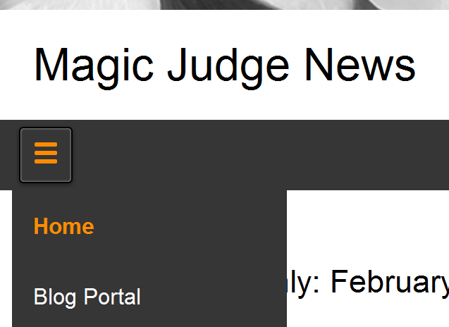
You might have seen that various sites on the network have a new theme, e.g. Magic Judge News or Official Resources. These sites are also optimized to display their content better for devices with a smaller screen, mainly speaking of phones, but also tablets or maybe even your smartwatch. Pages that adapt to this are called responsive.
The most obvious change is the navigation bar, that becomes a hamburger button. We also remove other things from the page like the header image or the sidebar, because we want to focus on the important content.
Why is being responsive important?
More and more the web gets accessed via mobile devices. Imagine judges accessing content during tournaments, conferences, or social activities when multiple judges meet and want to share content with each other. Making your content better accessible for them is a key feature. When looking at the numbers, we can actually see that mobile devices are almost as popular as desktop access:
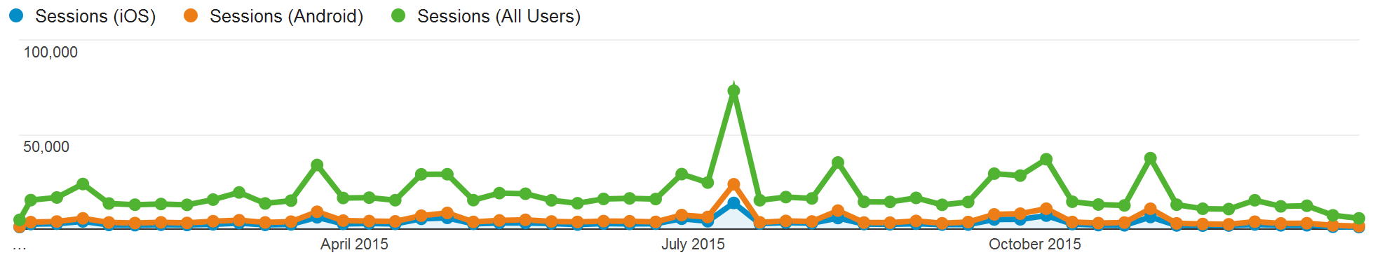
In total 17.73% (175,237) of all visits where from iOS (any mobile Apple device) and 26.51% (261,972) came from an Android device. This is a total of 44.24%. In fact this number surprised me a little as I expected it to be higher. Quite possible that the fact that our content wasn’t really well accessible with a mobile device hindered growth in this area. But you see that delivering a good experience to your mobile visitors is important.
Okay, how can I get in on this deal?
Glad you asked. We consider this such an important feature that at some point in the future we will require all blogs to switch to the new theme. This deadline is not yet defined, but you will know well in advance. Until then we encourage your site to switch as soon as you feel comfortable to. There are certainly still a couple of bugs on our side to iron out and the more people use the new theme, the quicker we will find and fix those bugs.
Here is how you switch:
- Go to your admin panel for your blog.
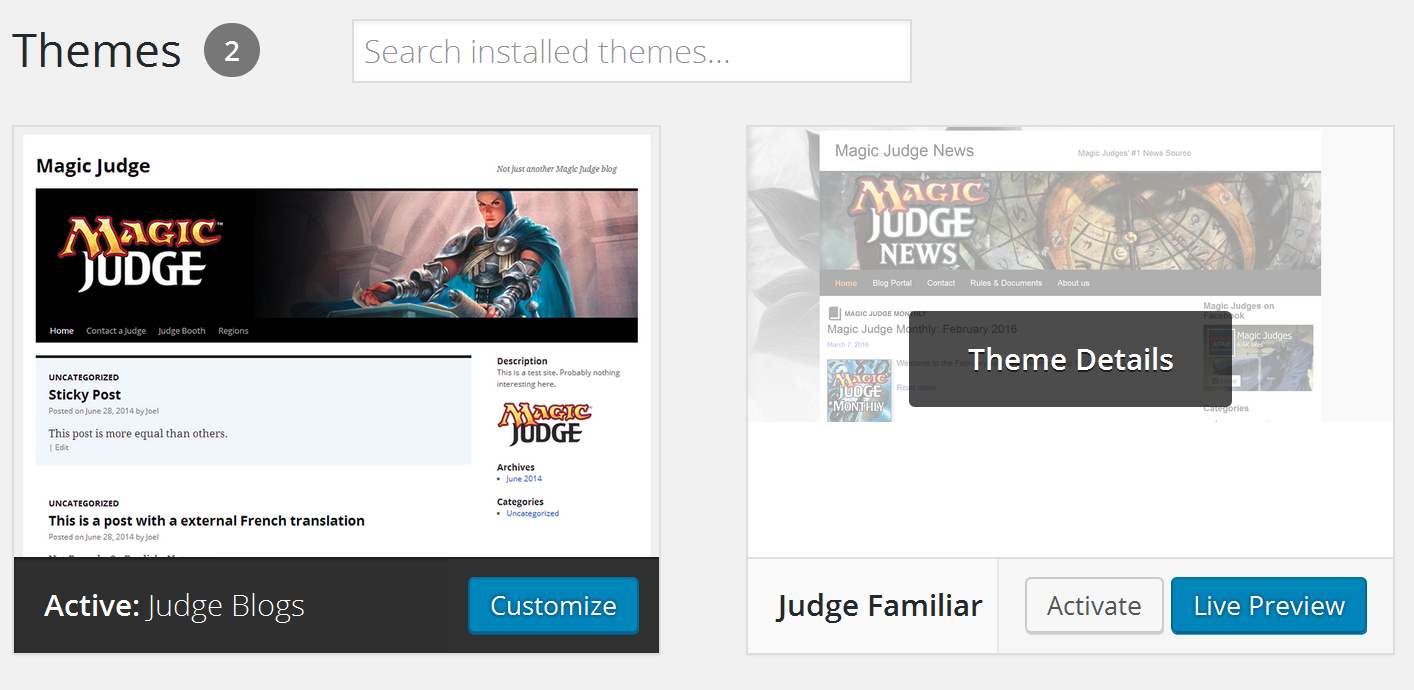
- Select Appearance > Themes.
- Click on “Live Preview” of the Judge Familiar Theme.
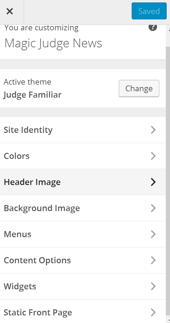
- Change your header image to the one you had before. You might have to slightly crop it, as the new theme is slightly wider.
- Select the menus you had before.
- Save your changes.
- Browse your blog and make sure things look the way you want to.
As mentioned before, we certainly expect some bugs to pop up. Please don’t hesitate to report those. We can best reached over the Judge Apps forum. We will reach out to the high-traffic blogs over the next week and help them migrate to the new theme.